In this article, I will show the importance of a minimalist
website in today's busy world. If you want to show a lot of information about what you do, There's a better way. I will show you how.
This article, part of "The Minimalist series." You can read all the posts in the links below:
The Minimalist Website
Outline
- Synopsis on website trends through the years
- The simplification process
- How to increase retention with a minimalist site
- Minimalist site vs. "Loaded site."
- Minimalist website in action
- Resources to help you take control of your site
Synopsys of website trends through the years
As a young boy, I remember the first time I experience the internet. It was dialup, and websites took minutes to load. Paying for internet service by the minute made sure sites were simple with not a lot of graphics. When the competition came, pricing improved, and businesses and families could afford to get a dedicated line for the internet.
When broadband entered the playing field with DSL and cable connections, website design exploded with multiple elements. Do you remember having to install a flash player to view some sites?
When the internet came to your phone, it was Deja Vu to the dialup days. It wasn't until 3g that you could enjoy a somewhat fast web experience, but desktop websites were still king.
Today most of the
internet traffic begins with mobile devices. Data caps no longer bound us, and you could operate an entire business out of your smartphone. If your website is not mobile-friendly, you were left behind.
With the proliferation of web services, site design platforms that automatically size your desktop website to mobile size is simple. The problem lies when sites pack all the information to display on your mobile device, turning your site into a never-ending scrolling machine. Adding to the problem is that we have too many things fighting for our attention, and the average time people spend on a site is less than a minute.
You only have 30 seconds to make an impression on your visitors before moving on to the next thing. These precious seconds are the main reason to implement the minimalist website now.
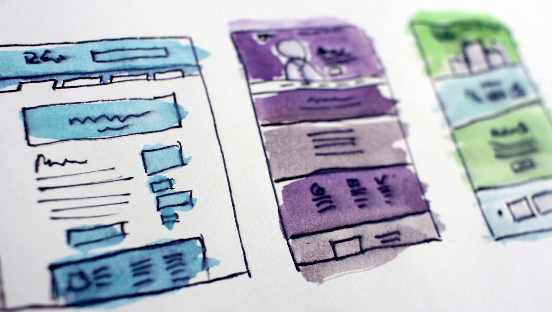
The simplification process
If you have a business with a physical location, your company must have a business profile with all the popular search engines. Most search engines have "places for business" or "my business," and these features are the first line of exposure when people search for the services you provide. Don't forget map sites such as Apple Maps.
You must look and update the search engine information to be simple, clear, and with a call to action that directs people to your site's services. Once people click on the business profile website, what will your potential client see?
Most company's websites are just a "glorified business card" that only gets visitors when their business owners direct their potential clients to their site. Is your website working for you, or are you working for the site?
To begin the simplification process, you must start with a smartphone in mind. Open up your site on the phone and think about the following questions:
- What is my website's job?
- Is my home page loading fast? How many seconds does it take to load?
- Does the site show call to actions without having to scroll?
- Does it have your slogan, logo, and matches your branding?
Once you review the questions above is time to "trim the fat" or remove excess information from your home page. Don't worry! I will show you how to add it back in a better way next.
How to increase retention with a minimalist site
Have you ever met someone ready to unload all their information at once? I can recall many encounters with such individuals that didn't show any interest in getting to know me. All they wanted to do is give me their promotional material and bombard me with information.
Like in real-life encounters, your website has to show interest in the viewer's needs. Rather than bombarding with information on the home page, there should be calls to action enticing people to find out more.
The ideal job of a website is to introduce your business or brand to the audience. I believe that if your brand is related to a person (usually the owner or CEO), the more connected the audience feels with the business. A website is working hard when your audience has that feeling of knowing or identifying with you before they meet you. Or, if you meet someone first, your website should contribute to the deepening of your networking encounters.
The best way to "let your audience in" and get to know you is through a blog. Blogging can be a daunting task, especially if you want to do it right. Remember all that information that most websites have on their home page? Well, you need to convert all that information into applicable stories that will help your audience.
Most businesses use their blog to sell their audience rather than help their audience. If a reader smells selling, your chances of retaining die.
If you simplify and convert information into blog articles, it shows the search engines that your site is active and a trust-worthy source of information.
Minimalist Site vs. "Loaded Site"
Minimalist site - Lower cost of design and development.
- Loads fast (very important for optimization these days)
- It directs your audience to spend more time on your site
- It prioritizes the mobile experience (search engines won't rank your website if it senses that the mobile experience is a dumbed-down version of the full site.)
- Uses the blog to inform and retain the audience with applicable information.
- When a website shows activity, the search engines rank it higher because it encourages visitors to come back.
"Loaded site"
- Much higher cost of design and development
- It takes a long time to load on mobile networks
- It takes longer to launch because of all the images and pages your need to fill.
- Overwhelms visitors with information and can be frustrating when you only have 30 seconds to make an impression
- Since all the information is there, the website doesn't show activity.
- You are encouraged to "set it and forget it."
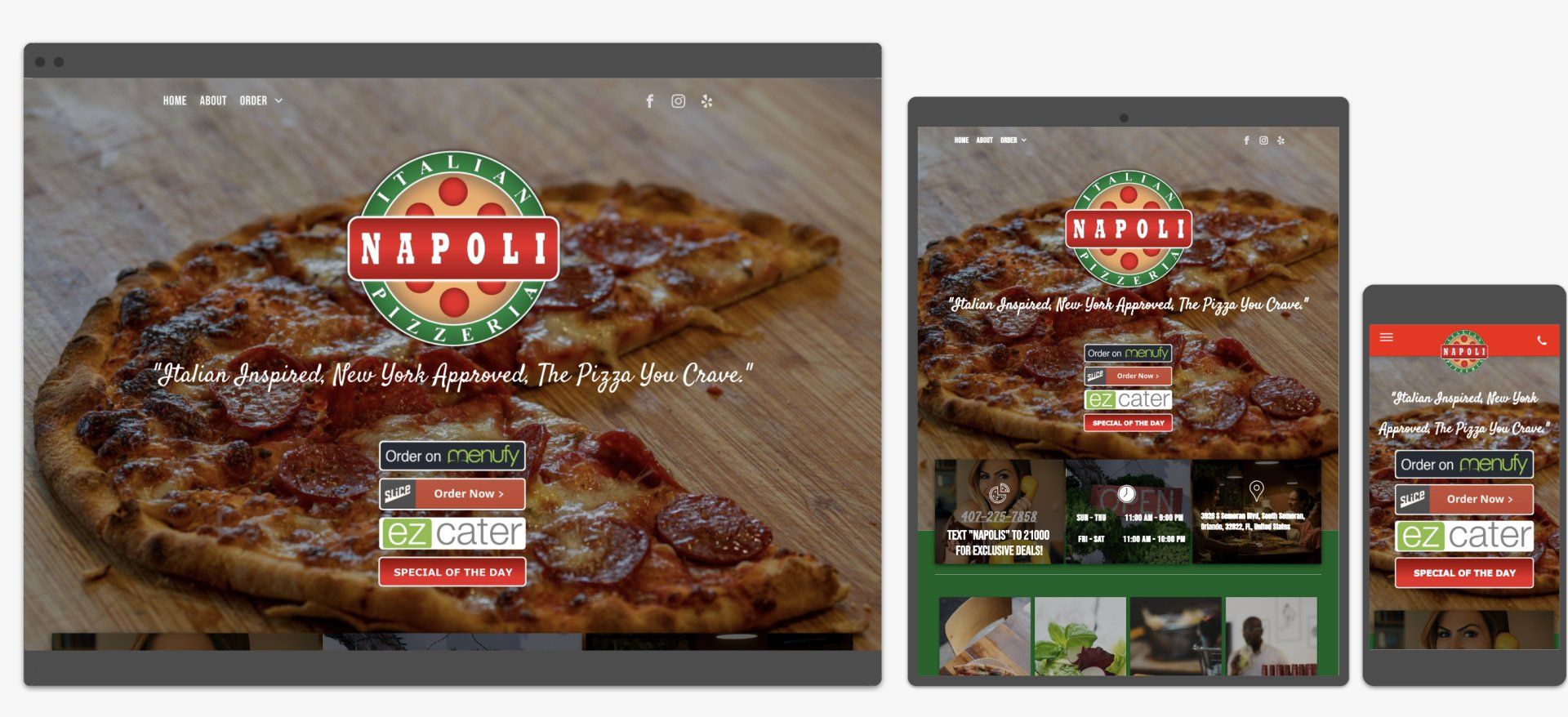
Minimalist website in action
I selected this
local pizza place
over a big corporation so that you can observe how any small business can benefit from this strategy.
Restaurants have a particular challenge to please their distinct customer base. Many people like to order online, but there are many service providers. Uber eats, Slice, Menufy, etc. are a few that they have to keep in mind to capture as many customers. There's always the "click to call" customer that wants to talk to someone.
All of these providers create menu websites of their own for the restaurant. The menus are embedded in the "places of business" for search engines.
How can you organize all this information In a way that helps you stand out from the competition? Minimalist website to the rescue!
The website for
Napoli Italian Pizzeria
takes all the different menu sites and places them as soon as you open the site. The website has a mobile-first design that loads in under 5 seconds on mobile networks to guide their clients to their most frequently used services. A customer can click to go to their site and click to call or get to the ordering site in less than 10 seconds.
As I mentioned before, you only have 30 seconds to make an impression on a website visitor. From loading to call to action in less than 10 seconds without scrolling leaves you with 20 additional seconds to give customers a chance to browse the site.
The restaurant plans to launch a blog "Pizza Stories" soon to keep their customers coming back for events and dinner ideas beyond their signature "Italy meets New York" flavor.
If you focus your site, clean it up, and simplify its message, you will reduce the cost of designing a new website or converting an old one.
Why not use the money saved to invest in the blogging and marketing of the site?
List of resources to help you take control of your site.
Here are the tools I use to help tailor sites for speed and customer engagement:
This free tool made by google helps you optimize your page for speed. It gives you a score for both mobile and desktop. Aim to be between 60 and 100. The important thing is to test your site on a mobile network for experience rather than a benchmark. But this took will show you something you can improve.
This tool helps me forget about grammar and focus on what I want to convey. It is not perfect, but it will help you develop your thoughts and correct monotonous loops. It has a correctness, clarity, engagement, and delivery score. You can even check for plagiarism and send your document for professional proofreading.
This tool has monthly on annual fees but is nothing compared to the benefit.
This tool is for email campaigns. You can upload your email lists and create landing pages to capture new subscribers. You can start free with up to 1000 subscribers. This free program is fantastic, and they don't force you to show their logo at the bottom.
How long does it take for your favorite sites to load? Do you have any sites that employ this minimalist approach? Let me know in the comments!
Miguel Guinard